Card-like designs are seen often in UIs. Usually, some view with a white background, rounded corners, and a dark shadow that makes the view look like a card on top of another view. Not too complicated to implement, but gives a nice look to different view components and separates parts of UI.
Let’s see how to create it.
Card view
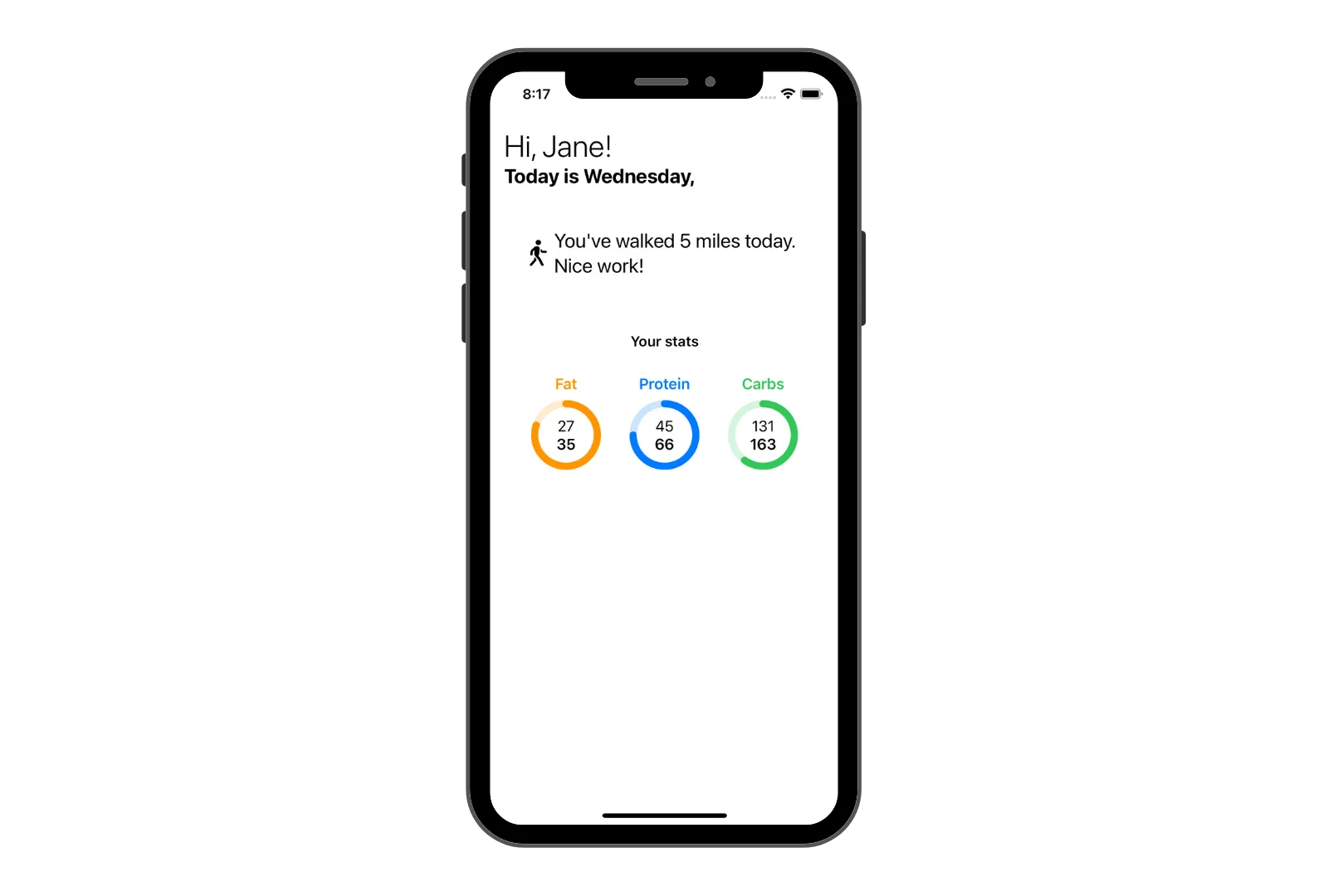
Any view can be created as a card view. It only depends how you want to design your UI. Let’s create a home page for a macronutrient tracking app. It has a title as a greeting, current day of the week, some information on user’s activity and a breakdown of macronutrients.

It’s a simple, flat UI, and it looks good.
This is where the card view comes into place. While the UI of the view is not that bad at all, we can make it much better. By modifying some UI components into card views, we’ll separate different pieces of information for the user. This will make UI more readable and user can glance at different information more quickly.
We’ll create a reusable view modifier that will transform any UI component into a card.
Custom view modifier
Just as SwiftUI already gives us some default view modifiers, like font() and padding(), we can also create our own, custom modifiers. Bundling view modifiers into a custom modifier lets you declutter your view code and avoids the overheard of maintaining your UI. Changing a font in a single place is much easier than going over 100s of files.
We’ll create a custom CardBackground view modifier so it can be reused whenever we need it. You can create separate files for every modifier, but I like to keep them all in a single file. Or, at least, group them by type.
import SwiftUI

// view modifier
struct CardBackground: ViewModifier {
    func body(content: Content) -> some View {
        content
            .background(Color("CardBackground"))
            .cornerRadius(20)
            .shadow(color: Color.black.opacity(0.2), radius: 4)
    }
}
Here, we create a custom CardBackground view modifier and apply three modifiers: .background(), .cornerRadius, and .shadow(color:radius:). By applying these modifiers, we can make any UI component into a card view.
I’ll keep the same values for corner, color and radius throughout, but you can pass these values with the modifier as well if you want to change them for different views.
You’re able to use the new view modifier by calling it with .modifier(CardBackground()). However, it doesn’t look great on the call site so we’ll write an extension on the view. Your modifier will look like any other modifier you’ve used.
// view extension for better modifier access
extension View {
    func cardBackground() -> some View {
        modifier(CardBackground())
    }
}
With the code above, you can now apply your modifier to any view with .cardBackground().
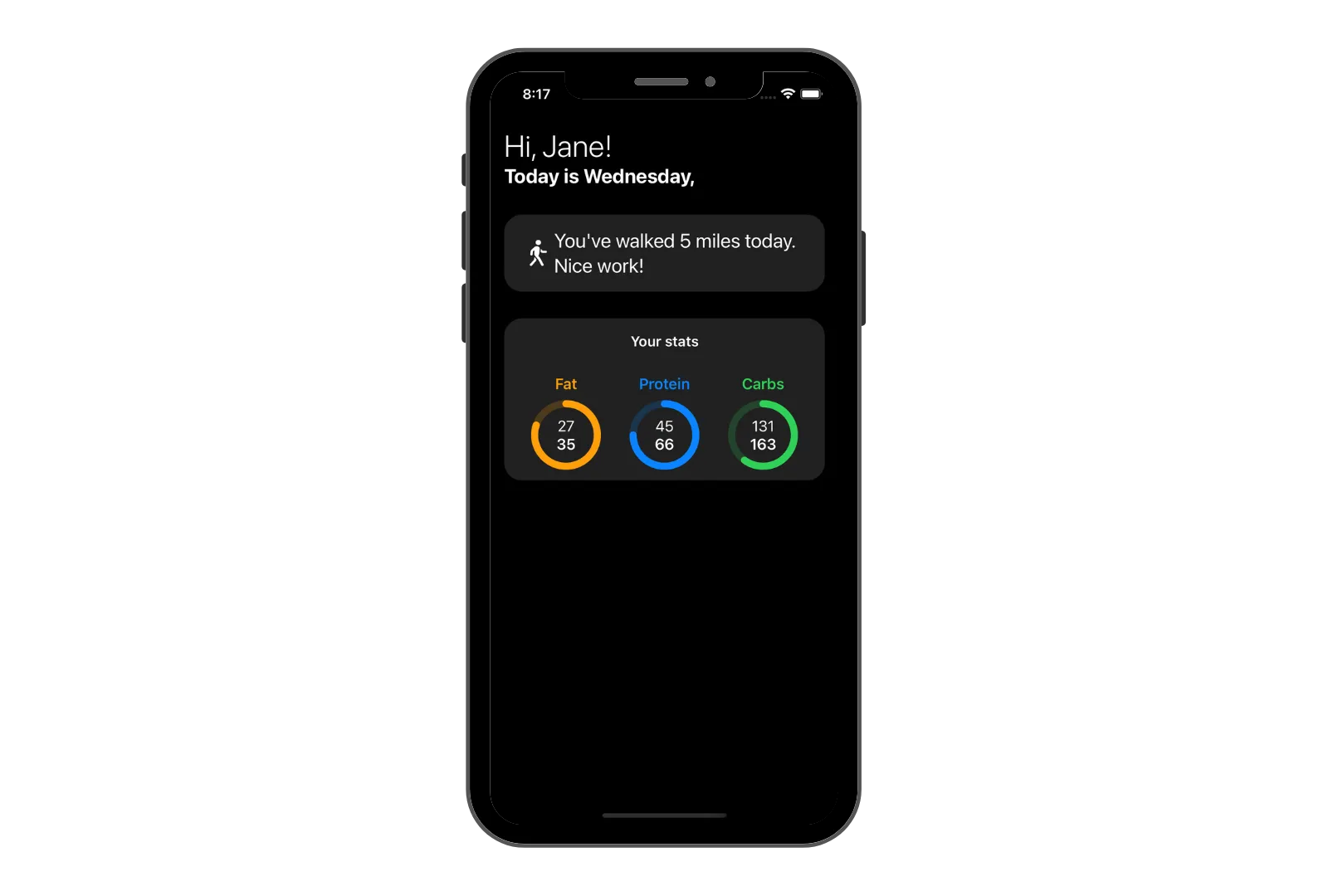
I’ll apply it on the user’s activity view and the macronutrient view.

Look at that! Much better.
Light mode looks great. But what about dark mode?
Dark mode support
To support dark mode in a card view, we need to take a look at the colors we use. We use colors in two places; one in the background of the card view and another in the shadow.
You might have noticed I’ve used a background color of Color(“CardBackground”) in the .background() modifier above.
For light mode, that’s white. But white doesn’t work for dark mode.
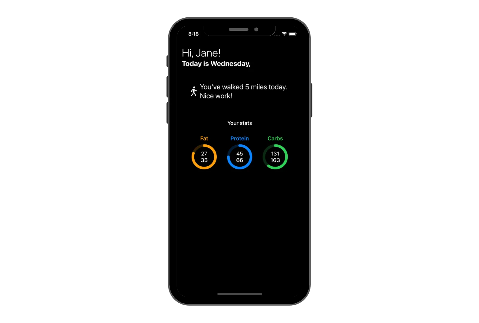
What about black color? If we use the same color for the card view as the color of the parent view’s background, we lose our card view:

In this case, you just have to make sure you use a different color. Or a different shade of black, like a dark gray. I’m using the default primary color for the view’s background, so I’ll use a lighter version for the card view background.
Create a new custom color in your Assets file called CardBackground or any other name you’d like. I’m using white for Any Appearance and Lead from Pencils section for Dark, or #212121 hex color.
Dark mode now looks like this:

Wow, look at that. Quite nice. But wait, where’s the shadow?
The color of the shadow matches the color of the parent view, or in this case, black. This means that shadow is neutralized in the dark mode. We don’t need a shadow in the dark mode and a white shadow will not look good at all.
Your UI still looks great without a shadow in the dark mode and it’s completely fine to have different designs for different appearances.
Final Thoughts
I like to use this type of card view in my designs.
It makes your UI look great and it doesn’t require a lot of effort. It’s easy to implement and looks much better than a flat design.
Please feel free to reach out on Twitter if you have any questions, comments, or feedback.
Thank you for reading and happy coding!
