LabeledContent was introduced in SwiftUI 4.0 at WWDC22 and it’s one of the many features that can help you write more readable code.
LabeledContentis available on iOS 16.0+.
Label and value in an HStack with a Spacer
You likely have a lot of views in your app that display a label and a value with a space in between.
Something like this:
struct ContentView: View {
    var body: some View {
        Form {
            // Version 1
            HStack {
                Text("Name")
                Spacer()
                Text("Samantha Carter")
                    .foregroundStyle(.secondary)
            }

            // Version 2
            HStack {
                Text("Age")
                Text(43, format: .number)
                    .frame(maxWidth: .infinity, alignment: .trailing)
                    .foregroundStyle(.secondary)
            }

            // Version 3
            HStack {
                Text("Home Planet")
                Spacer()
                Group {
                    Image(systemName: "globe.europe.africa.fill")
                    Text("Earth")
                }
                .foregroundStyle(.secondary)
            }

            // Version 4
            HStack {
                VStack(alignment: .leading) {
                    Text("Team")
                    Text("SGC")
                        .font(.callout)
                        .foregroundStyle(.secondary)
                }
                Spacer()
                Text("SG-1")
                    .foregroundStyle(.secondary)
            }
        }
    }
}
There are many different variations of this label-value component which you could extract into reusable views. But you’d end up with a lot of custom code.
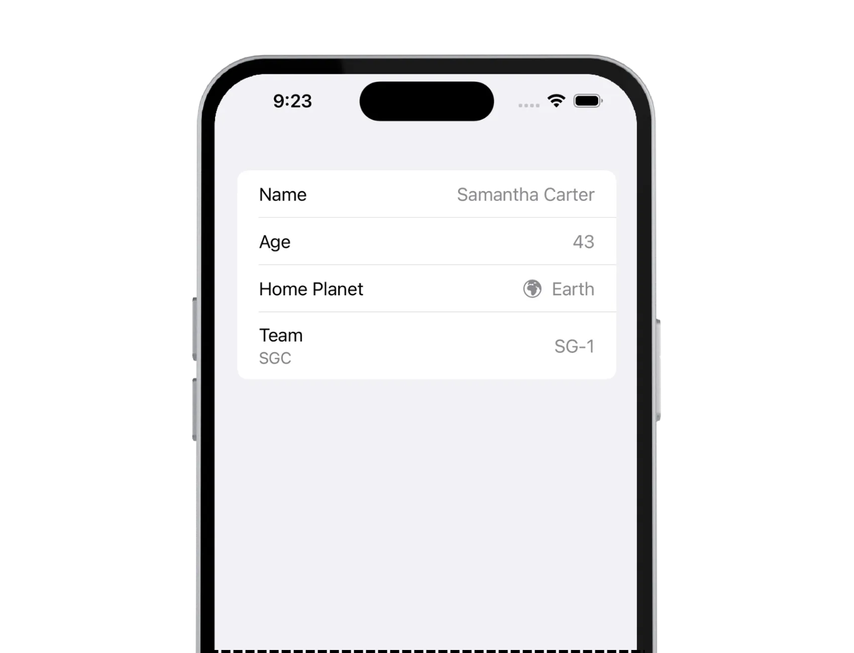
This is how it looks like in UI:

Pretty standard. You can see these types of views, or some variations, implemented in many different apps on different platforms.
But, instead of creating custom components yourself, there is a better way. This is where LabeledContent comes into play.
LabeledContent
LabeledContent does exactly what the name suggests, it adds a label to the content. The content is a read-only or read-write value, and the label describes the purpose of that value.
What’s great about this component, it’ll automatically adapt to its container view, a Form or a Toolbar, for example.
Let’s see how we can rewrite the above code:
struct ContentView: View {
    var body: some View {
        Form {
            Section {
                // Version 1: String label & String value
                LabeledContent("Name", value: "Samantha Carter")

                // Version 2: String label & formatted value
                LabeledContent("Age", value: 43, format: .number)

                // Version 3: String label & any View as value
                LabeledContent("Home Planet") {
                    Image(systemName: "globe.europe.africa.fill")
                    Text("Earth")
                }

                // Version 4: Any View as value & any View as a label
                LabeledContent {
                    Text("SG-1")
                } label: {
                    Text("Team")
                    Text("SGC")
                }
            }
        }
    }
}
That’s 30 lines of code less! And it’s easier to read. How awesome.
LabeledContent has a lot of different initializers you can choose from depending on your use case.
And UI hasn’t changed at all:

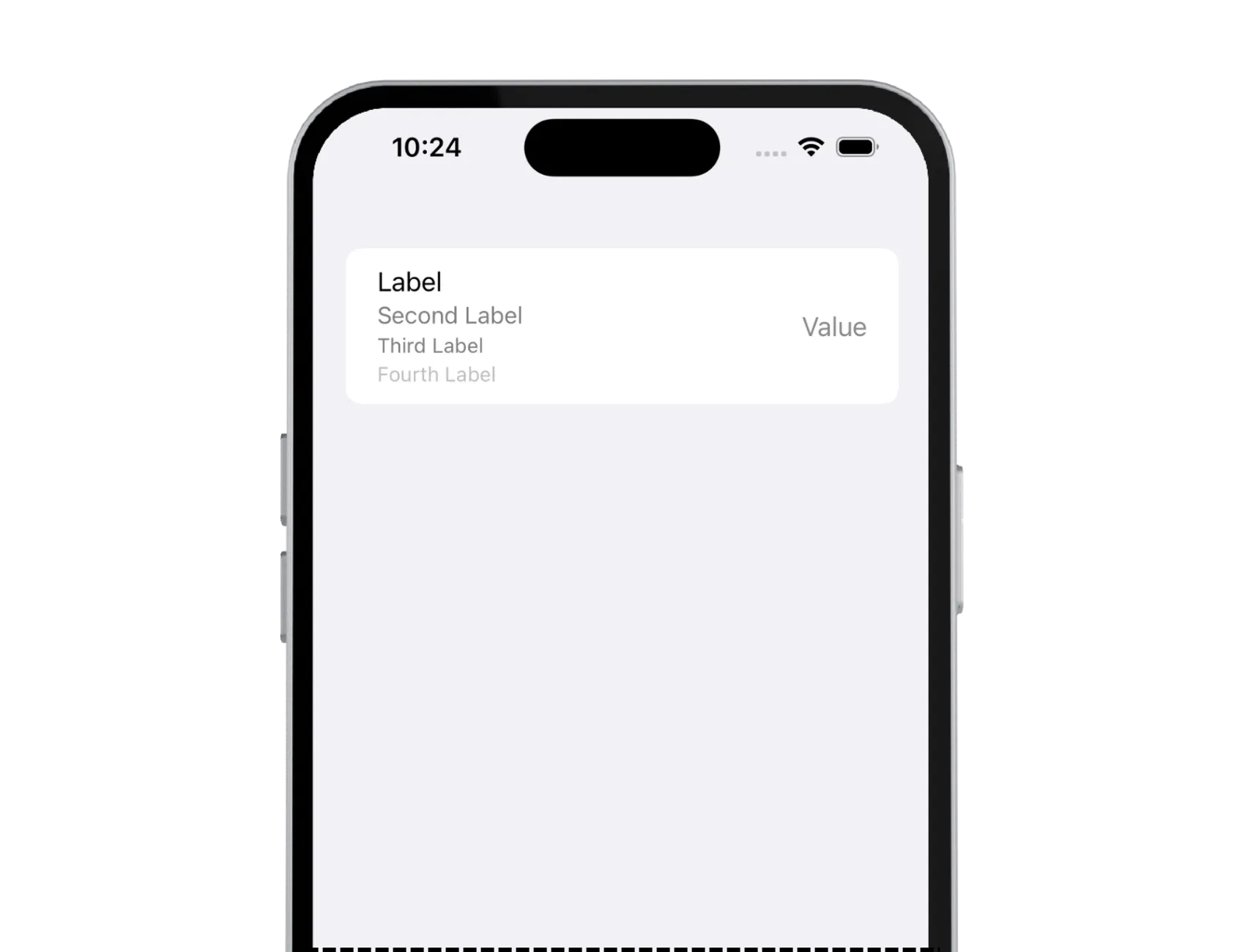
In the last example above, version 4, the initializer accepts any view as a label. We added two Text views, but it accepts any number of views. Notice how the styling changes in the UI for the second text. It’s much smaller and has a .secondary color applied. A third one is a lot smaller than a second one, and the same goes for the fourth.
However, you can keep adding more views, but the styling won’t change after the fourth view.
In the code:
struct ContentView: View {
    var body: some View {
        Form {
            // Version 4: Any View as value & any View as a label
            LabeledContent {
                Text("Value")
            } label: {
                Text("Label")
                Text("Second Label")
                Text("Third Label")
                Text("Fourth Label")
                // You can add more views, but styling won't change
            }
        }
    }
}
This is what it looks like in the UI:

In case you need this specific use case, the styling is already there, you don’t have to implement it yourself.
Custom Styling
Use LabeledContentStyle to create custom styles for the component to customize it to your needs.
Final Thoughts
I’ve only recently found out about this small gem of a component. It completely slipped my eye. I was happy to refactor all my custom components and now my code is more readable. I love it!
Do you know any cool components like this that were introduced recently and you love using them? I’d be happy to learn all about it!
Please feel free to reach out on X (Twitter) or Mastodon if you have any questions, comments, or feedback.
Thank you for reading!
